Table of Contents
Summary
I mapped how affordable housing and public transit are distributed by neighborhood throughout Chicago to reveal the neighborhoods with optimal access to both housing and transit. I found that neighborhoods on the South and West sides of Chicago have the most affordable housing units, but that the South side has the worst public transit access because there are fewer connecting train stops that serve a larger area. I reasoned that neighborhoods on the West side of Chicago overall are the most accessible to both affordable housing and public transit.
Maps
Map 1: Click here for the live version.
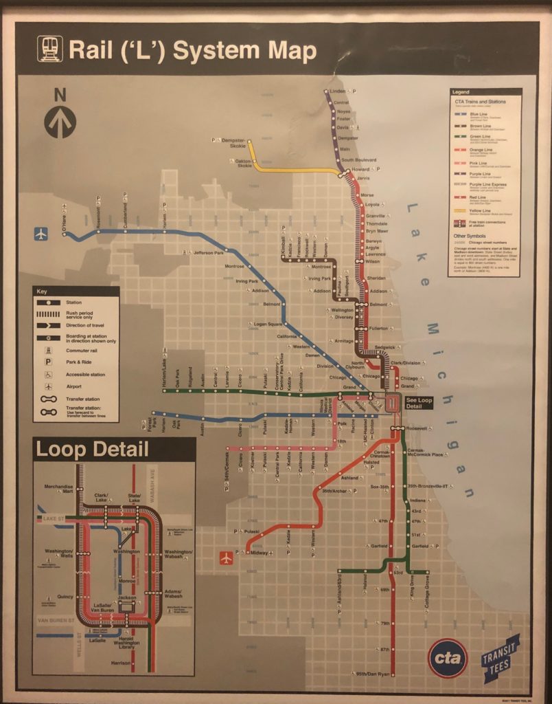
Chicago ‘L’ System Map (Image from the author, click link to view map from Chicago Transit Authority – cannot post here due to copyright issues)
Map 2: Click here for the live version
Map 3: Click here for the live version
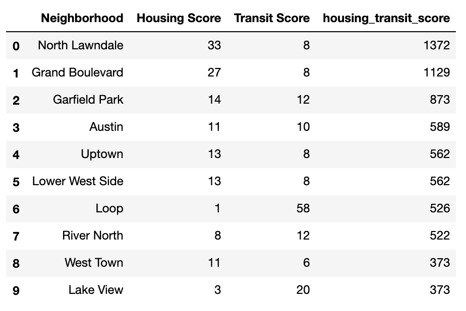
Top 10 Neighborhoods by Housing and Transit Access
Introduction
I’m very interested in Chicago’s public train system, the ‘L’, because I feel it’s one of the few existing systems that brings together people from every walk of life and forces them into a common experience of going somewhere. It is also commonly understood, however, that public transit has been built in unequal ways to benefit some groups of people and make it inaccessible to others. For many, the privilege to choose whether or not to take public transit drives (and in some cases, takes away) the choice of where to live. For people who live in affordable housing and rely heavily on public transit to get around, it becomes crucially important how close they live to a train stop. A complaint I’ve read about is the lack of affordable housing built near public transit. I wanted to look at how affordable housing and public transit is distributed by neighborhood throughout Chicago, and the best neighborhoods to live in for optimal access to both housing and transit.
Assumptions, Limitations, and Metrics
- While Chicago has robust bus and commuter rail networks, for the purpose of this project I defined public transit as just the L (train).
- This analysis did not incorporate the size of neighborhoods in any calculations – measuring density of housing/transit in an area to evaluate access would be a useful addition for future exploration.
- I used the number of train lines that connect at a station multiplied by the number of directions each line takes from that station as a metric that represents connectivity. A station at the end of a line has a connectivity of 1, because at that station you can only take a train in one direction. For a station serving multiple lines closer to downtown Chicago, the connectivity is higher because you have the option between multiple train lines in multiple directions.
- I created another metric, called “Housing-Transit Score” that measures the accessibility of a neighborhood to affordable housing and public transit. It has two multiplied components: a housing score and a transit score. The housing score is simply the number of affordable housing units in that neighborhood. The transit score is the sum of transit stops in the neighborhood multiplied by each stop’s connectivity (see metric above). I wanted the housing and transit components to equally contribute to the housing-transit score, but given that the number of affordable housing units outnumbers the number of train stops in Chicago, I had to adjust the scale (1 housing unit = 2.25 transit stops each with a connectivity of 1.125) so that the housing and transit scores get equal weight.
- I did not include the Purple Line in connectivity calculations, because the Purple and Purple Express Lines never actually run concurrently (during rush periods, purple = purple express). I felt that counting the Evanston stops as both would overvalue them.
Using open-source data from the City of Chicago and the python packages pandas, geopandas, and bokeh, I built a few maps that visualize the relationship between affordable housing and public transit access in Chicago neighborhoods.
Key Takeaways
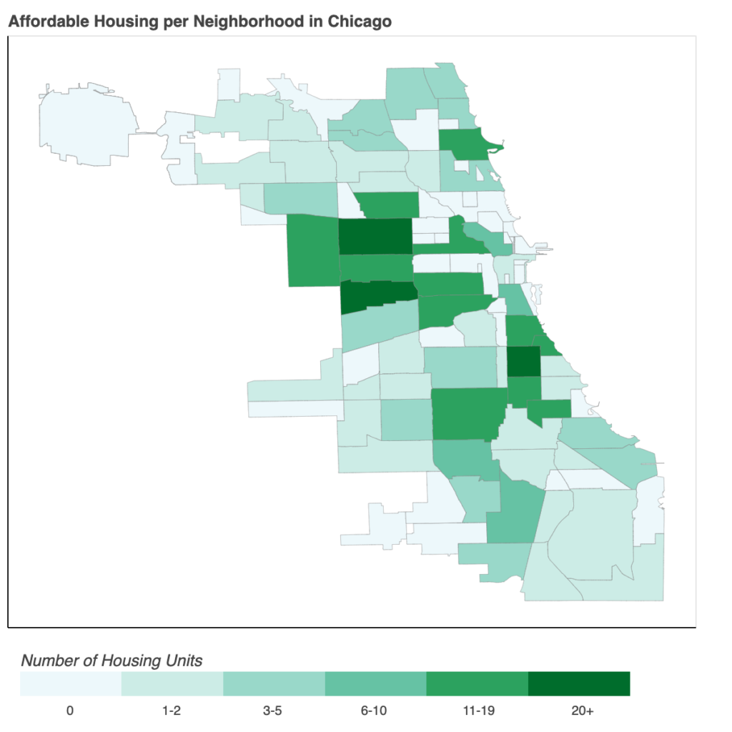
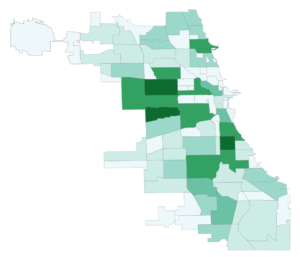
- Neighborhoods in the South and West sides of Chicago have the most affordable housing units, while a good chunk of neighborhoods right around downtown Chicago (the Loop) have almost no affordable housing at all.
- The neighborhoods with the largest number of affordable housing units do not appear to be in complete public transportation deserts – most have at least one train line running through.
- Neighborhoods with the most affordable housing have the least connective train stations in comparison to the rest of the city.
- This is because the trains running through the North side are clustered along the same stretch of streets in a smaller area and connect often, while the lines serving the South and West sides cover a larger geographical area and branch away from each other to do so (see L System Map).
- Neighborhoods with the most affordable housing generally appear to be larger and have fewer transit stops than the Northern and Northwestern neighborhoods bordering downtown, meaning that affordable housing neighborhoods are at a disadvantage with fewer train stops and lines serving a larger area.
- The most optimal neighborhoods by affordable housing and transit access are largely on the West side of Chicago.
- Neighborhoods from the South and North sides of the city, however, also have representation within the top ten rankings.
- From a solely transit-oriented perspective, it appears that the near North and near West side neighborhoods are the most advantageous to live in, and from a solely housing-oriented perspective, it appears that the South and West side neighborhoods are the most advantageous to live in. When weighting transit and housing equally, the most optimal neighborhoods to live in are spread all around Chicago, with certain West side neighborhoods particularly ideal.
It is critical to think about these maps against the backdrop of Chicago’s history of racist housing and transportation policies. Using redlining and restrictive covenants that barred black people from owning homes or living in certain neighborhoods, whites paved a segregated city in the 1940s, with blacks predominantly clustered into low-income neighborhoods on the South side. Additionally, the Chicago Housing Authority built public housing almost entirely in these neighborhoods, while also removing train stations on the Green Line, thus significantly limiting access to jobs and other parts of the city. These racist housing and transportation decisions cut off access to economic opportunity for blacks in Chicago.
The South side of Chicago deserves better transportation options (more stops and connections) to both connect them to other parts of the city and help bring opportunity to their own neighborhoods. Constructing affordable housing with a focus on proximity to public transit would benefit communities all across Chicago. The city cannot continuously disadvantage people by building affordable housing in unconnected areas, because many do not have the economic means to “just move” to an area with more robust transit. While the L currently illustrates the geographical separation of Chicago by race and class, it has the potential to be an equalizer and integrator.
Tools
I used numerous resources including documentation and stack overflow threads for instruction and code inspiration, and relied heavily on these Medium articles: Exploring and Visualizing Chicago Transit data using pandas and Bokeh, Walkthrough: Mapping Basics with bokeh and GeoPandas in Python, and Let’s make a map! Using Geopandas, Pandas, and Matplotlib to make a Choropleth map.
All of the data I needed was available through Chicago’s Open Data Portal. I used three datasets:
- Affordable Rental Housing Developments
- Boundaries – Neighborhoods
- CTA – System Information – List of ‘L’ Stops
I housed the code in Jupyter Notebook and used three python packages:
Code can be found in my GitHub repository.
Methodology: Important Notes
I have explained in detail some key steps and the code I used below. For a step-by-step code walkthrough, check out the Jupyter Notebook.
Part 1: Affordable Housing by Neighborhood Chloropleth
Data Cleaning: Finding Housing Units with Mismatched Neighborhoods:
I needed to isolate the housing units in neighborhoods that don’t match up with neighborhoods in the boundary dataset. Not all neighborhood boundaries are universally agreed upon, and there can be sub-neighborhoods or larger areas that encompass multiple neighborhoods that can cause dissonance between the data (ex. Wicker Park is in West Town). As we can see below, there are some typos and neighborhoods that need to be re-named to fit in with the neighborhood “definitions” set forth by the boundary dataset.
#find housing units with mismatched neighborhoods
right_only = housing_merged.loc[housing_merged['_merge'] ==
                                'right_only']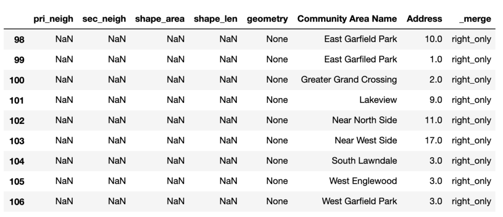
I cleaned up the original housing data file so no housing units had mismatched neighborhoods.
#fix typos
housing.replace({'East Garfiled Park':'East Garfield
                  Park'},inplace=True)
housing.replace({'Lakeview':'Lake View'},inplace=True)

#match up mismatched neighborhoods
housing.replace({'West Englewood':'Englewood',
                 'Near West Side':'Little Italy, UIC',
                 'Near North Side':'River North',
                 'East Garfield Park':'Garfield Park',
                 'West Garfield Park':'Garfield Park',
                 'Greater Grand Crossing':'Grand Crossing',
                 'South Lawndale':'Little Village'},inplace=True)
Data Cleaning: ARO Properties:
Additionally, I kept seeing housing units with no location and a property type of “ARO.” When I looked it up, I found out that “ARO,” which stands for Affordable Requirements Ordinance, is a requirement that certain residential developments offer a percentage of units at prices affordable to households at or below 100% of the Area Median Income, so I presumed they were mixed income developments. When I googled some of the addresses of these ARO units (since they had no location in the dataset), they all appeared to be newly constructed luxury apartment buildings, but nothing on their websites or elsewhere tied them to ARO. Upon further investigation, I found that there is a loophole in the ordinance that allows developers to pay a fee to the city in lieu of adding affordable units, and that a fair number of developers opt for this route. Given the uncertainty about whether there were actually affordable units in these buildings or just in-lieu fees, I decided to drop all ARO buildings from my analysis.
#drop rows with non-affordable housing
luxury = housing[(housing["Property Type"] == 'ARO')].index housing.drop(luxury, inplace=True)
Creating a GeoDataframe from a Dataframe with Patches:
In order for bokeh to be able to look at the neighborhood boundaries and transform them into visual shapes (called glyphs), the spatial data must be stored in a special mapping between column names and lists of data called a ColumnDataSource . The ColumnDataSource is a JSON dict, and so we’re going to store the data in a GeoJSON format because we want to create glyphs that are patches (polygons). First, we need to read the dataframe we’ve been working in as a geodataframe (so that the polygon coordinates are transformed into shapely objects), then store the data in a GeoJSON format.
#read dataframe as geodataframe
gdf = gpd.GeoDataFrame(housing_nbhoods, geometry='geometry')

#convert geodataframe to geojson
geosource = GeoJSONDataSource(geojson=gdf.to_json())
Logarithmic ColorMapper and ColorBar:
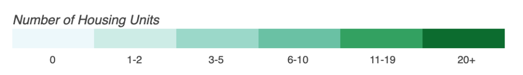
I set up the colorbar, or the annotation that will dictate how the neighborhoods are shaded. To map the colors, I used the LogColorMapper (instead of a linear color mapper) because I thought a logarithmic scale better distinguished between neighborhoods with very few affordable housing units. I had to hardcode custom tick marks on the color bar so that the default tick marks wouldn’t be used (logarithmic scale gave less user-friendly tick marks).
# Define color palettes
palette = brewer['BuGn'][6] palette = palette[::-1] # reverse order of colors so higher values have darker colors

# Instantiate LogColorMapper that exponentially maps numbers in a range, into a sequence of colors.
color_mapper = LogColorMapper(palette = palette, low = 0, high = 40)

# Define custom tick labels for color bar.
tick_labels = {1.35:'0',2.5:'1-2',4.6: '3-5',8.5: '6-10', 16:'11-19',
               30:'20+'}

# Create color bar
color_bar = ColorBar(title = 'Number of Housing Units',
                     color_mapper = color_mapper,
                     label_standoff = 6,
                     width = 500,
                     height = 20,
                     border_line_color = None,
                     location = (0,0),
                     orientation = 'horizontal',
                     ticker=FixedTicker(num_minor_ticks=0, ticks=
                                        [1.35,2.5,4.6,8.5,16,30]),
                     major_label_overrides = tick_labels,
                     major_tick_line_color = None,
                     major_label_text_align = 'center')
Linear (left) vs. Logarithmic (right)
Hard-coded color bar.
Part 2: Affordable Housing Choropleth with Overlaid Public Transit Stops
Creating a GeoDataframe from a Dataframe with coordinates:
In order to map the stops, the data must be cleaned to separate the location into columns of latitude and longitude, which then need to be stored as shapely objects in a geodataframe.
#Need to convert Location to Latitude and Longitude columns
new = L_Stops["Location"].str.split(",", n = 1, expand = True)

#remove parentheses
new[0] = new[0].str.replace("(","")
new[1] = new[1].str.replace(")","")

#convert type from string to float
new[0]= new[0].astype(float)
new[1]= new[1].astype(float)

#split into 2 columns
L_Stops["Latitude"] = new[0]
L_Stops["Longitude"] = new[1]

#convert Latitude and Longitude to geometry datatype
GeoStops = gpd.GeoDataFrame(
           L_Stops,geometry=gpd.points_from_xy(L_Stops.Longitude,
           L_Stops.Latitude))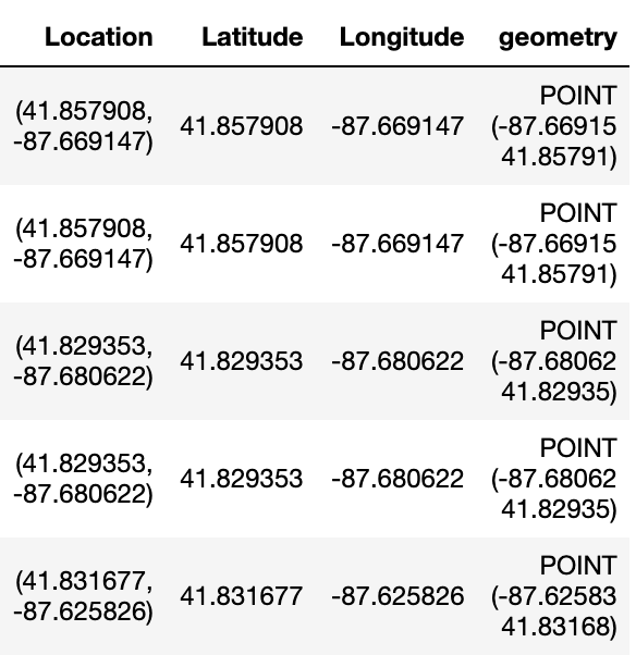
Need to separate Location into Lat and Long, which are used to generate shapely geometry.
Adding Counter for Number of Connecting Lines per Station:
Next, I’m going to add a column that will count how many lines are served by each station, or as mentioned in the assumptions above, the connectivity metric. I will first convert the train line fields from Boolean datatypes to binary integers, then sum all the values per row into a new column called Num_Lines.
#Convert boolean to int
GeoStops["RED"] = GeoStops["RED"].astype(int)
GeoStops["BLUE"] = GeoStops["BLUE"].astype(int)
GeoStops["G"] = GeoStops["G"].astype(int)
GeoStops["Y"] = GeoStops["Y"].astype(int)
GeoStops["Pexp"] = GeoStops["Pexp"].astype(int)
GeoStops["Pnk"] = GeoStops["Pnk"].astype(int)
GeoStops["O"] = GeoStops["O"].astype(int)
GeoStops["BRN"] = GeoStops["BRN"].astype(int)

#add a column summing the number of lines that connect at each stop
GeoStops['Num_Lines'] =
GeoStops[{"RED","BLUE","G","BRN","Pexp","Y","Pnk","O"}].sum(axis=1)
GeoStops_Lines = GeoStops.copy()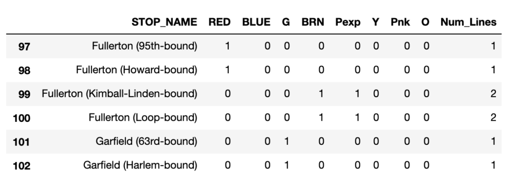
Counter for number of lines served by each stop.
Finally, one last bit of cleaning needs to be done. Each stop in the dataset contains all the directions a train may take there. At the end of a line, that number should be 1, because when at that station you can technically only take the train in one direction. However, in this dataset, an “arrival” is counted as a direction at the end of every line. I had to hard code the removal of each of these instances at a termini since there was no uniform string or format each station contained.
#drop rows with an extra direction at the ends of lines

end_lines = GeoStops_Lines[(GeoStops_Lines["STOP_ID"] == 30077) |
                           #Forest Park end of Blue Line
                           (GeoStops_Lines["STOP_ID"] == 30171) |
                           #O'Hare end of Blue Line
                           (GeoStops_Lines["STOP_ID"] == 30249) |
                           #End of Brown Line
                           (GeoStops_Lines["STOP_ID"] == 30182) |
                           #End of Orange Line
                           (GeoStops_Lines["STOP_ID"] == 30203) |
                           #End of Purple Line
                           (GeoStops_Lines["STOP_ID"] == 30089) |
                           #95th end of Red Line
                           (GeoStops_Lines["STOP_ID"] == 30173) |
                           #Howard end of Red Line
                           (GeoStops_Lines["STOP_ID"] == 30026) |
                           #end of Yellow Line
                           (GeoStops_Lines["STOP_ID"] == 30139) |
                           #Cottage Grove end of Green Line
                           (GeoStops_Lines["STOP_ID"] == 30057) |
                           #Ashland end of Green Line
                           (GeoStops_Lines["STOP_ID"] == 30114) |
                           #end of Pink Line
                           (GeoStops_Lines["STOP_ID"] == 30004)].index
                           #Harlem end of Green Line

GeoStops_Lines.drop(end_lines, inplace=True)
Create ColumnDataSource for Glyphs and Hover Tool:
In order for bokeh to map the stops as glyphs and to create a hover tool over the stops indicating the stop’s name and connectivity, the locations of the train stops in the dataframe need to play nicely as special lists of x and y coordinates. I created a ColumnDataSource dictionary of lists of all the columns from the Grouped_Stops dataframe that I would need to create the glyphs and hover tool. I scaled the sizes of the stops (circle_sizes) so that the difference in connectivity between each stop was visible, but made sure the actual (non-scaled) connectivity of each stop would show up over the stop in the hover tool.
# Convert stops dataframe to a ColumnDataSource
source_stops = ColumnDataSource(data=dict(
                        x=list(Grouped_Stops['Longitude']),
                        y=list(Grouped_Stops['Latitude']),
                        sizes=list(Grouped_Stops['Num_Lines']),
                        #scaled so differences b/w number of
                        lines/station is visible
                        circle_sizes=list(
                                      Grouped_Stops['Num_Lines']*2.5),
                        stationname=list(
                                      Grouped_Stops['STATION_NAME'])))

#Create hover tool for stops
hover = HoverTool(names = ['hoverhere'],tooltips=[
    ("Stop", "@stationname"),
    ("Connectivity", "@sizes")],attachment="right")

# Create figure object.
p = figure(tools=[hover],title = 'Affordable Housing Rapid Transit Access in Chicago')

# Add patch renderer for stops
stops = p.scatter(x='x',y='y', source=source_stops,
                  size='circle_sizes',
                  line_color="#FF0000",
                  fill_color="#FF0000",
                  fill_alpha=0.05,
                  name = 'hoverhere')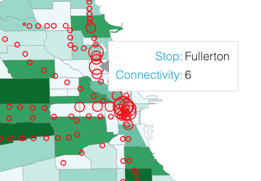
Stop sizes scaled to show difference in connectivity, and hover tool shows raw connectivity.
Creating L stops Size Legend:
I added a legend to indicate how the stops varied by size (i.e. connectivity/number of directions). Unfortunately, despite all the attempts and workarounds I tried, there is no way to allow size to vary in legend glyphs, so I had to hard code three separate legends for each size I wanted to show and then stagger all of them. I ended up calling the sizes “connections” (rather than “directions”) to assuage the fact that one can take multiple different train lines from the same stop in the same direction.
#Add Legend that varies by size
legend1 = Legend(items=[
    LegendItem(label='1 connection', renderers=[stops])],
    glyph_height=19, glyph_width=6, location=(22,85),
    border_line_color = None, label_standoff=16,
    title='L Stations',title_text_align="left", title_standoff=15)

legend2 = Legend(items=[
    LegendItem(label='4 connections', renderers= [stops])],
    glyph_height=25, glyph_width=25,location=(13,50),
    border_line_color = None, label_standoff=7)

legend3 = Legend(items=[
    LegendItem(label='8 connections', renderers=[stops])],
    glyph_height=50, glyph_width=50,location=(1,1),
    border_line_color = None, label_standoff=-5)

p.add_layout(legend1)
p.add_layout(legend2)
p.add_layout(legend3)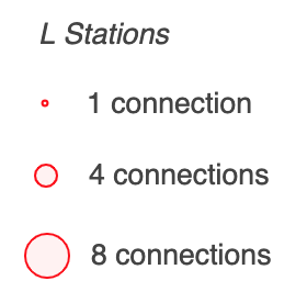
L Stations Legend(s).
Part 3: Affordable Housing and Public Transit Access Choropleth
Finally, I wanted to visualize the data in a different way on a map by combining housing and public transit into one metric. In order to do this, we must match up each L stop with its neighborhood by merging the stops dataframe with the neighborhood boundary dataframe.
Spatial Join:
With a spatial join, the dataframes will be merged on their shapely geometry datatypes by checking if each neighborhood-polygon geometry contains each L stop-point geometry. I used a left join (with the neighborhoods dataframe = “left”), so the merged dataframe will retain all the neighborhoods that don’t have any transit stops.
#spatial join on geometry to match stops with neighborhoods
spatial_joined = gpd.sjoin(housing_nbhoods, Full_Stops,
                           how='left',op='contains')
spatial_joined = spatial_joined[["pri_neigh","Address","MAP_ID",
                                 "STATION_DESCRIPTIVE_NAME",
                                 "Num_Lines"]]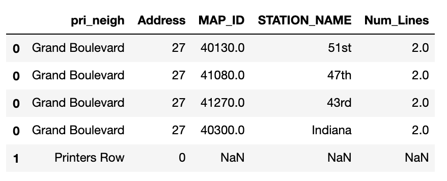
A slice of the merged dataframe showing that Grand Boulevard has 4 stops, while Printers Row has 0.
Calculating Transit Score:
The transit score is a metric that measures the connectivity of transit of a neighborhood.
First, we will count all the stops in a neighborhood and multiply each transit stop by its connectivity (I started calling this metric “conn_dist” because I saw it as a distribution of connectivity).
#Count number of stops per neighborhood
stops_nbhoods = spatial_joined.groupby(["pri_neigh","Address","Num_Lines"]).count()
                       [["MAP_ID"]].reset_index()

#Add new metric that measures number of stops*connectivity / neighborhood
stops_nbhoods["conn_dist"] = stops_nbhoods["Num_Lines"]*stops_nbhoods["MAP_ID"]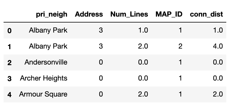
Many neighborhoods have multiple stops with different connectivities. Since we want one connective distribution score per neighborhood, we must sum all the connective distribution scores by neighborhood.
#Take summed conn_dist per neighborhood
stops_nbhoods = stops_nbhoods.groupby(["pri_neigh","Address"]).sum()
                                     [["conn_dist"]].reset_index()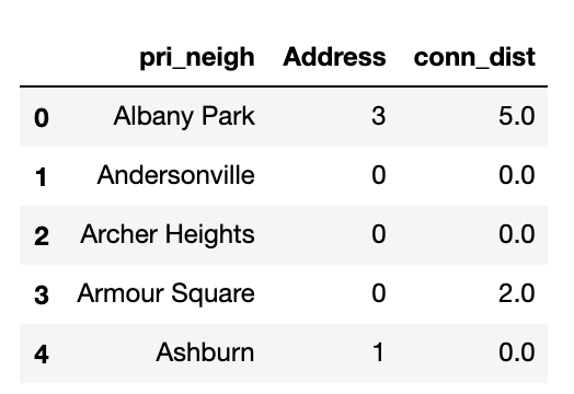
We have now calculated the transit component of the housing-transit score. The last step is to combine it with the housing component – which will just be the number of affordable housing units.
Weighting Housing-Transit Score:
However, before we do so, we must decide how each component will be weighted. While the value of housing vs. transit in determining where to live is ultimately up to the individual, for the purpose of this project, I decided to weight housing and transit equally.
To capture this in the metric, I adjusted the scale of the transit score (conn_dist) by multiplying it by 4.5 to make it equivalent to the housing scale. This means the scale was adjusted so that 1 housing unit = 2.25 transit stops, each with a connectivity of 1.125.
#Adjust conn_dist to weight its score equally with housing
stops_nbhoods["adj_conn_dist"] = (stops_nbhoods["conn_dist"]+1)*4.5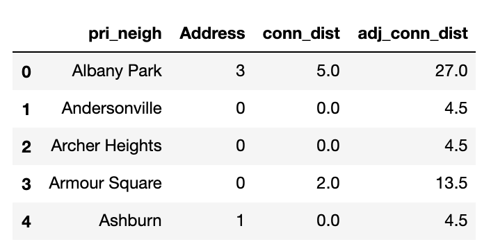
Finally, I calculated the housing-transit score by multiplying the number of housing units by the adjusted transit score for each neighborhood.
#Calculate housing-transit score
stops_nbhoods["housing_transit_score"] = ((stops_nbhoods["Address"]+1)*(stops_nbhoods["adj_conn_dist"]))-4.5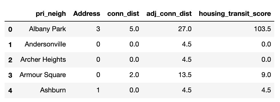
Note: I had to add 1 to both the transit and housing scores so that an individual score of 0 would not make the housing-transit score 0 when components were multiplied. I subtracted 4.5 (the weighting factor) once the score had been calculated to readjust the scale to start at 0 (I wanted a neighborhood with 0 housing units and 0 transit stops to have a housing-transit score of 0, not 4.5).
The final choropleth was then created using the housing-transit scores for each neighborhood.